Some years back when this blog started, it wasn’t about rolling ball sculpture. It wasn’t even focused chiefly on art! It *was* focused on creativity, and that aspect of it will always be alive and well. Today’s entry is a great example.
This week I had my monthly metalsmith meetup group. It’s a great opportunity to get together with some other artists and swap ideas. Our focus this month was on Design – big “D.” How did we approach design and what sorts of ideas and considerations were part of our design process?
It very often (Maybe all the time?) looks like I just grab some wire, and with total abandon and complete lack of planning, just start a-bendin’ and a-weldin’ and somehow magic happens. In some instances, yeah, I just kind of throw caution to the wind, but lots of times I really am following some sort of plan and working within parameters.
I have one piece in particular which always comes to mind when I think about planning and design, and I brought said piece to the meetup with me. Here is its most basic component:
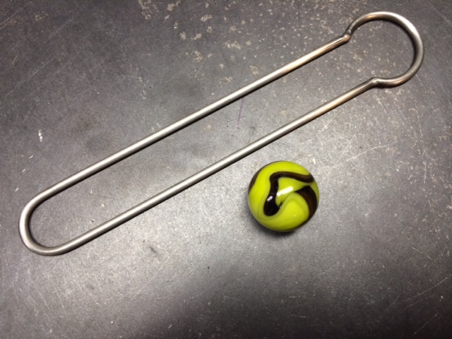
Maybe not much with just one piece…
I went through a series of months where I was on a self-wrought mission to create one new piece of sculpture a week. Given that I work a day job, that’s a huge challenge, and I had to figure out a way to do things more quickly. I had to come up with new construction techniques and ideas and…designs.
The track section above came to my mind when I tried to think of the simplest, quickest and most efficient way to create track. Actually, I could simplify it a bit more, but I think it would have lost some coolness, so I made this piece! After I made this piece I made:
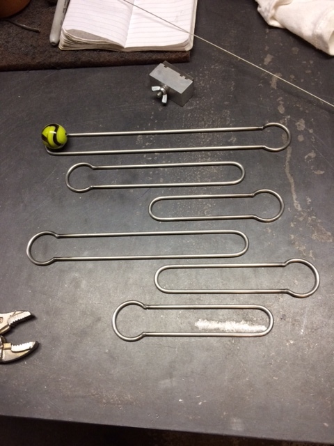
Many pieces…
So now I had lots of pieces of track. It was so simple it just felt brilliant! It was like a jigsaw puzzle you could put together any way you wanted, and you got a cool image when you were done! (Do they make those puzzles? The should!) I started fitting them this way and that, having fun and getting to literally see what the track was going to do as a completed piece (a fair bit, anyway), before any welding took place. Pretty cool!
Once I’d mocked it up in my head I got down to the hard part and made it reality. Behold, Dropping In:
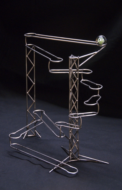
Add some creativity, a lot of hard work, and voila!
Um, I *might* have lost some simplicity and speed somewhere, because you’ll notice the incredibly cool(!) uprights that I fashioned. Those took a long time to make, involving the measuring, cutting and fitting of lots of little pieces along with a complex welding process to get the three-sided tower completed.
It was a great overall success, however. I made a stunning piece that uses NO curved track AT ALL! It’s the only piece of created to date of that kind. It uses very carefully leveled track so that the marble does not roll too fast, which was not an easy task to accomplish. The results are very pleasing, however, and well worth the effort.
As of the writing of this post, Dropping In is still available. If you’d like to learn more about it and see video of it in action, click here. If you have any questions about it, or would like me to create something along these lines but customized for your particular wants and needs, send me a message here.
Thanks for reading, and be sure to drop back in for more art updates. I appreciate your enthusiasm for my work!


