
Decore at Yats, one of my favoritest eateries of ever.
Decore at Yats, one of my favoritest eateries of ever.

.
At the art center where my photo club meets they do a big thing on the celebration of the Day of the Dead, which is the Latino remembrance of friends and family members who have passed. The idea is that November 1st and 2nd are days when it is easier for the souls of the departed to visit the living, and so altars of sorts are constructed to encourage this connection. They do a bunch of pretty involved altars and decorations at the art center, and they even teach classes on making stuff like sugar skulls. This is just one small portion of a very large altar that someone had constructed. Everyone loves those little skeletons. Admit it, you do too.

.
Does anyone remember when I did Masterpiece in a Day last year? If not, well here’s the short version: I did it. If you do, then you’ll know a lot more. You have about six hours to create an entire piece of art from beginning to end. It’s an annual event. Here’s my buddy Darrell working on his sculpture. MiaD is so friggin’ cool that I’ll probably have to devote an entire blog entry to it. Oh, and I did manage to complete my piece this year! It was a day full of win.

It's art! In boxes!
I got a call from my friend Darrell the other day. He said, “There’s this art installation going on down near Mass Ave.”
“What is it?” says I.
“They’re doing art in these giant metal shipping crates. You want to go?”
Now, I have no idea what constitutes an art installation, and wasn’t really sure exactly how this worked in conjunction with metal shipping crates. I didn’t know how “giant” the size would be, or what we’d be looking at, or why it was so interesting or novel. It would all have been a scheme from which to tempt five dollars from my thin little wallet. I didn’t know.
“Yes,” I said.
Given that I knew nothing, it seemed like I must find out, and now, so shall you.
The basic deal was that they had brought out six of those big shipping containers that you always see out by a dock somewhere. These weren’t crates as you normally think of them. They weren’t square boxes, cubes. These were those big, long, corrugated metal things. The containers open at each end, and they were divided in the middel, so one container would hold two different exhibits.
Here’s an overall view of a few of them:

I wish I had some more images for you, but at art shows it’s kind of a courtesy not to take pictures of someone’s art work (’cause it’s like, you know, stealing!). I was able to get at least a partial view of one of the more interesting ones, and you can see Darrell taking part below.

You actually lay down on this thing (it was explained to be likened to an MRI) and then it carried you prone into the display and then back out. It was pretty freaky. There were some video screens with images being played over them plus jumbled audio messages being played at the same time. It was weird, kind of cool, kind of scary, and definitely met up with some of my expectations for the event. Some of the other displays were nice, but not quite so much what I was expecting. Some of the artists seemed to use the space more as a standard type of display area, and I guess I was expecting a little more wackiness out of the whole thing.
Darrell mentioned that often times an installation is geared more toward the use of the space as a whole and making it into an area of complete expression, a space that defines and identifies itself separate from the area around it. One work that did this pretty well had a curtain over the entrance, and when you went inside the whole friggin’ interior looked like a pine forest! There were tree-like posts set about, the three available walls all had black and white charcoal drawings of the forest, and the floor was covered with real pine boughs, needles, and pine cones. There were sounds piped in of wind and birds. It was pretty cool. The only thing that kind of brought down the effect a little was the fact that it was still daylight, and the inside of the container was warm rather than the coolness that the visuals implied.
There were some that were involved, but didn’t reach so far. One exhibit looked like a front yard leading to someone’s porch. There were flowers and stepping stones and old steel lawn furniture, and the back end of the exhibit even had a real wood front door. It was well done, but, well, you kind of looked at it and went, “Cute. Front yard.” It didn’t really go any farther than that.
Another was set up like someone’s living room, with a bunch of early sixties period furniture. The artist was displaying a number of small paintings on the walls of yet more home furnishings, explaining that she had bought them in some vague fit of nesting, but never had anywhere to use them in her tiny apartment, so she’d painted them, hung the paintings, and then put the goods in storage “pretty much in a container like this one.” She was fun to talk to. Later on as Darrell and I passed by the exhibit again I looked in and saw her and her friend sitting down to eat dinner at the couch at the back of the display, food set out on the coffee table. I got the eerie feeling that I was looking at a living room plunked down in the middle of an empty lot. It was probably the best moment I had during the whole experience where her art became reality for a few minutes.
Overall I had a good time. Since I’d never been to an installation, it was just fun to get out and see something new and different, even if not every exhibit was uber fantastic or mind-blowing.
After we’d taken in the show Darrell wanted to walk around a bit, so we headed down the street and I snapped some pictures along the way:

There was a church nearby, and I liked the look of the sun on the brick. I think black and white would have done a better job with this, but it was fun messing with the angles. Darrell and I as well as some other artists at the show, all remarked that this building would be outstanding as a set of lofts or studios for artists. It’s been empty for quite some time apparently.

Another view of the church with some vegetation gamely vying for living space.

Rigging shop. I just love that sign. They probably sell stuff here with cool names like “turnbuckle.”

Hook. Giant hook. Couldn’t walk by it without taking a picture. I kind of want this hanging in a big workshop. I wish I had a workshop big enough in which to hang it!
Hope you enjoyed the tour, kids. Sorry I’ve not been producing much on my own lately. It’s been a challenge. I’m hoping this changes in the near future. I hope you are all finding some inspiration of your own so that you too can “stay creative.”
Spent Easter with the fam as I am wont to do, and we performed the highly-anticipated ritual of coloring eggs. This was, needless to say, a perfect opportunity for everyone to indulge in a little creativity.
In my family the whole egg-coloring deal has held to tradition for decades. This means that we’re almost notoriously steadfast users of the Paas line of vinegar-scented chromatic madness. While there have been years where a crazy new idea came out (thinking of the year my older sister came up with some way of using food coloring and vinegar for these fabu starburst effects), we generally just stick with the tablets, some warm water, and then try and do everything we can to get the most out of the basic materials.
Here are some of this year’s results:

We had a bunch of fun this year, and mostly we let the kids do whatever they wanted to do, and the adults kind of goofed around with it. I recall in years past we had some pretty amazing results, but we were laid back about it this year. I’m probably the only one who was bothered about it, as I tend to take five times longer than anyone else in search of the “perfect” design, color, and style. (Yes, by now you are all familiar with how I can take something simple and overdo it. One year at a jack-o-lantern carving party at someone’s house I took as long to do one as everyone else did to do two of them. I’m sure my obsessiveness is entertaining. You’re welcome.)

Getting a closeup on these, you can see better how we work with our limited resources. You have to get pretty creative (awesome!) with your execution when your coloring depends largely on dunking an oblong shell-coated embryo into a coffee mug full of tinted water. There’s the whole half-in-one-side/half-in-the-other-side, and then of course you can go for the “suicide” effet – putting the egg into every single color on the table, but after you’ve covered some of the obvious tricks you begin to want to reach for something a little different. Okay, maybe you don’t, but I do, and so does some of my family, apparently.
The first one on the right was done by putting the egg in multiple colors, then removing it, patting it dry in a few spots with a towel, and submerging it again. This thing looked fantastic when it was done. It had a crazy purple/gray/blue thing going on. My sister’s friend did it. I thought it looked almost like concrete. It was awesome.

Above is a closeup of the ones I did. The foreground one was partly accident-related. Before I got hold of it it had been dropped. Didn’t matter, I love the way colors react around the damaged area. Check out how the blue has come out of the green at the cracks. Super sweet. Look further up toward the top and you can see a spiral that wraps around the egg. I got that by using a crayon and drawing on it, then submerging it.
The one with the wacky stripes on it came from putting the egg in read for a short time, then pulling it out and letting it dry a little, then wrapping rubber bands around it in random patterns and putting it back in, this time in purple. Rubber band ones are always fun.
The orange and yellow one was another crayon work. I put it in yellow and then scribbled all over it with crayon. When I put it back in I used red. I left it in a really long time, and the colors turned out nice and vibrant on that one.
And now for a little photo instruction. Check out these two photos:

and:

Have you sometimes wondered why your photos look like snapshots and not photos? A lot of it is in the lighting. The first (really cute!) photo was done next to a sunny window. You can see that the left half of the face has a nice, soft light to it. Skin tones look great, and it adds a lot of character to the photo.
The second photo looks fine, but the lighting is just…flat. It doesn’t do anything. This one was shot from a different angle, and the on-camera flash was used. Now, most on-camera flash is harsh and bright. Works great over a large variety of situations, and does a wonderful utilitarian job of getting illumination into all kinds of spots so you can see the subject in a dark room. However, it’s not the kindest of light. It’s flat, and it has no “color” so to speak. It makes pictures look like the one immediately above.
My little quick tip for you is if you’re trying to take a picture and make someone look as fab as possible, put them next to a window with some indirect lighting. This will soften wrinkles and round all kinds of unpleasant edges. Sunlight also has very nice color to it and won’t make the subject’s skin look pale or blue or any other number of undesirable shades.
My other nifty little tip is this: if you are using a point-and-click camera, and you do have to use the on-camera flash, but you really want to soften things up a bit, tape a piece of disposable tissue paper of the the flash. How many times you double it over is up to you, but try it out for fun some time and see how it looks. You’ll be amazed at how much nicer it appears.
They sell things like this for certain cameras. They’re called diffusers. You can’t get them for most pocket cameras, nor would you really want to mess with one, but in some situations it can be pretty cool, like if you’re at grandma’s 80th, and you want to get her with mom, and you want to take just a minute or two extra and get that quick shot where everyone will go “Aw…that looks great!” forever after.
When I was in college I couldn’t afford a diffuser for my zippy little mounted flash on my Nikon. I hated the harshness of the flash so much I ran around with a handkerchief rubber banded to the flash always. I never took it off, and I always preferred how that stuff turned out.
Hope you all enjoyed the recent holidays and that you had a chance to do some playing and have some creative fun.
I’ve been remiss in blogging, but it’s not been on purpose. My apologies. There’s been a TON of stuff going on these past couple of weeks, and it’s been hard to keep up with the daily life let alone blogging about it. I have photos, and I want to share them, but it’s going to take some time to get them together.
HOWEVER, part of what has been keeping me from blogging has been making more stuff, and I was quick enough last night to get the latest project on pixel, and still more amazed with myself for getting it formatted to stick up here. But I did, and I am.
Here’s a little foreward. The band played at a private party for some folks a week ago. Said folks have been responsible for my employment on more than one occasion, so they’re responsible for me owning things, even if it’s just gasoline to get through the week and maybe some low fat vanilla yogurt and Bear Naked Granola (mmm….yogurt and granola!). Oh, so anyway, I wanted to thank them for being such great hosts and all, because there have been occasions where I’ve played for someone and hoped I would never see said employer ever again in my life. This folks are cool. They deserved a little thanks.
I figured I’d send a thank you, only I’d sent them one before. I only have one kind of thank you card, so that seemed rather perfunctory of me. Somehow I got it in my head that I’d cut up a bunch of magazines and make them one. Now that I think about it, I can’t recall how I came to this conclusion, but I did. I know, it’s no big wow of an idea, but it is fun, and it beats the hell out of a regular card.
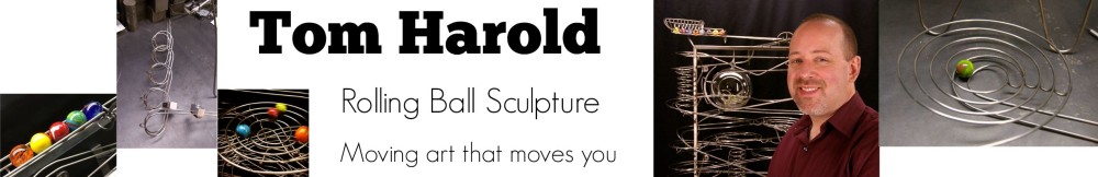
The short of it is that I spent WAY too much time on this, but had a great time doing it. All told, with consideration for gathering the materials and sticking them all together, I think I have about five or six hours in this thing. Really. I seem to get carried away. You may have noticed this. I don’t seem to be able to do anything “just good enough” when it comes to creative projects. (Wait until you see the RBS that Tina helped me with!) I will eventually pick up some more skills with scheduling and timing and whatnot, but I still go overboard.
Witness the front:

Front of card is the bottom half.
I showed this to my coworker, and she said, “Wow…there’s a LOT going on here!” I apparently did like I did with my early marker-and-Crayola projects, and just threw the book (the magazines?) at the thing. It’s a bit busy, but it’s fun.
Flipped over, so you can see the back easier:

Back of card is bottom half here.

Inside of card.
My coworker said, “It’s like a fun little ransom note!” Yeah, the cutout letters on the front reminded me of that as well. I had fun sticking all these wacky images together. The search was half the fun. The gluing was…not so fun, but I worked it out with minimal mess. I hope they enjoy this.
My sculpture stuff, the rolling ball sculpture, that’s kind of tough. I try to really put some serious effort into it and make it look nice. This was all about fun and goofiness. I could have gone really over the top with it, and, believe me, the thought occurred several times that “if I only had some stamps…and some paint…and some spray-tack…maybe some cloth.” It’s sick, I tell you, but I managed to resist all that.
I return again to that admonishing thought, that self-damaging thought which is always, “That’s not real art. That’s not serious stuff. That’s not good enough. That’s just kid’s play stuff.” This project is yet another way of giving the stiff-arm to that negative voice and pursuing some simple creative play. It’s good for your head and your heart. We all have old print media lying around. Get yourself some and have fun with it.
The spinoff of this project is likely one that I’ll make for mom for Mother’s Day. I think I’ll scan and print some old family photos for her and collage them together with other found media from various sources. I’ll put a little more effort into it (may take another trip to Mulitmedia to get some supplies), and we’ll see how it turns out.
Stay creative, kids!